GSG
Creating a unified design system that enhanced usability and scalability.
Role
Senior Product / System Designer
Responsibilities
As the Senior Designer, I found myself at the intersection of design and development. My role was to bring harmony between creative vision and functional requirements. I worked alongside and mentored junior designers to conceptualise the system, collaborated with developers to ensure feasibility, and engaged stakeholders to gather input.
The Challenge
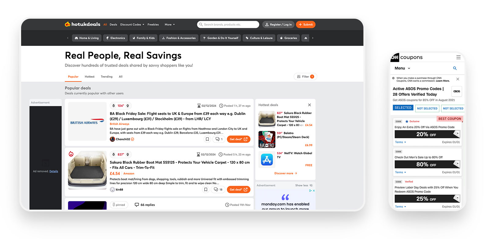
When Global Savings Group (GSG) approached me, they were managing an intricate ecosystem, 47 white-label platforms, each uniquely branded to reflect different partners’ identities. While this customisation provided flexibility, it came at a steep cost. Every update, no matter how small, required manual adjustments across all platforms. It was clear that scalability was a looming challenge. I asked myself, how could I design a system that preserved branding flexibility while streamlining updates and ensuring consistency?
The Research
Discovering Pain Points.
I began by listening. Through surveys and interviews with 15 partners and 50 end-users, I pieced together a narrative of fragmented workflows and design inconsistencies.
Partners often voiced frustration over the time-consuming nature of updates, while end-users noted subtle but noticeable differences in design elements that disrupted trust.
One insight stood out: 60% of stakeholders reported inefficiencies when applying updates across platforms. This confirmed that I wasn’t just solving for aesthetics, I was addressing operational bottlenecks.
Ideation
Imagining Solutions Together.
Ideation began with collaborative design sprints. Armed with insights, I brainstormed ways to make the system modular. Whiteboards filled up with sketches of reusable components, dynamic theming options, and configuration tools.
One standout idea was to use design tokens variables for colors, typography, and spacing that could be easily customized without altering the core structure. It felt like unlocking a puzzle piece that could fit any shape.
Design Process
Shaping the system.
The team and I began with low-fidelity components, sketching out concepts that emphasised modularity and customisation. Moving into higher fidelity, I built interactive prototypes to test our assumptions.
One prototype allowed users to preview design changes in real-time, instantly visualising how tweaks to colours or fonts would look. Seeing this come to life validated my hypothesis that empowering users with visual feedback would enhance adoption.
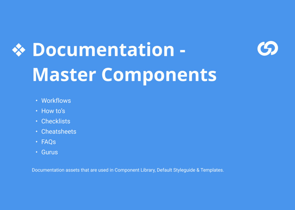
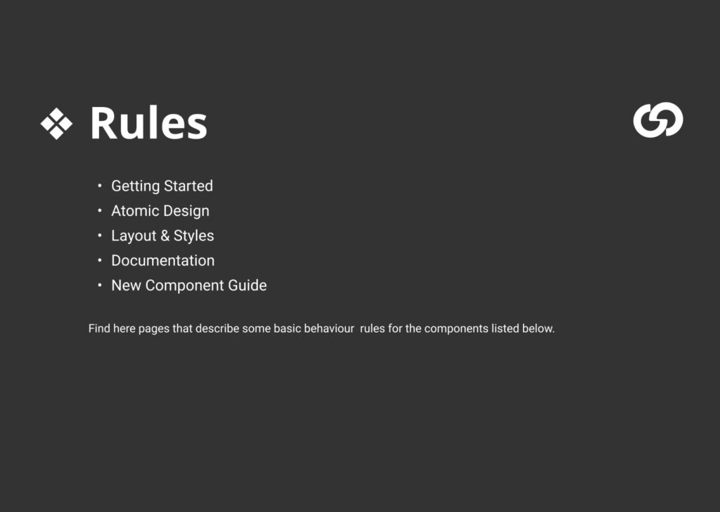
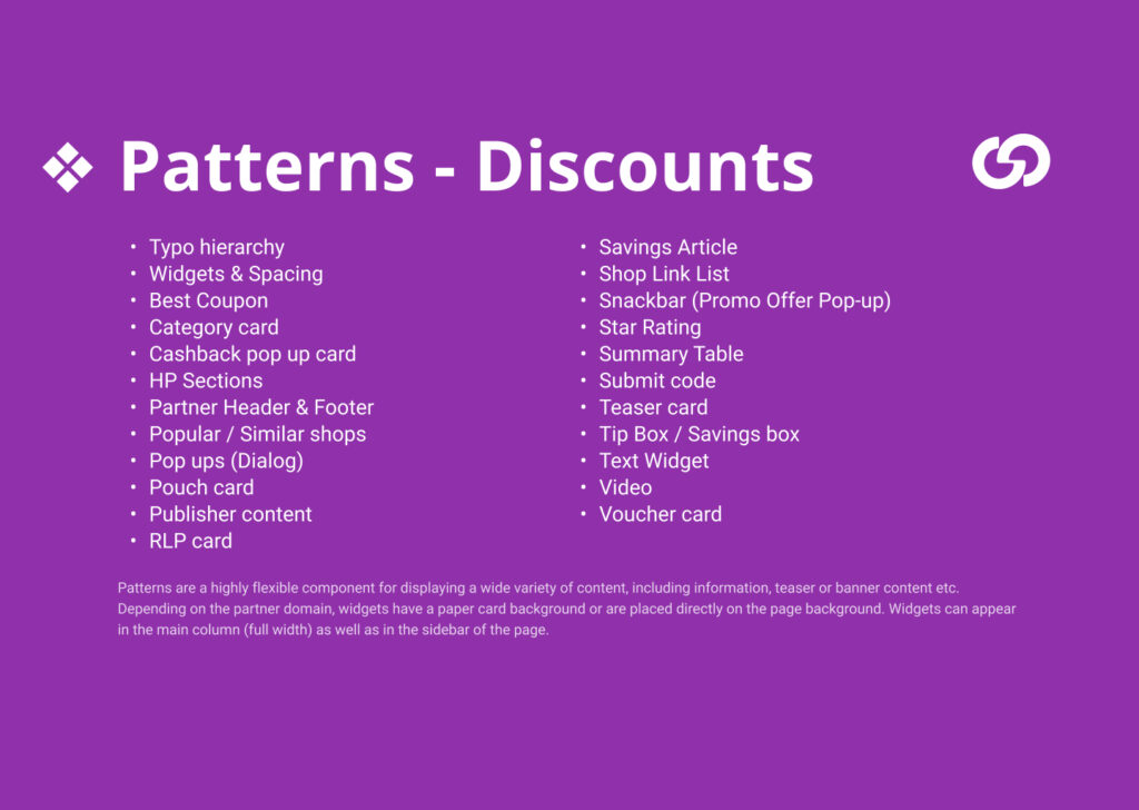
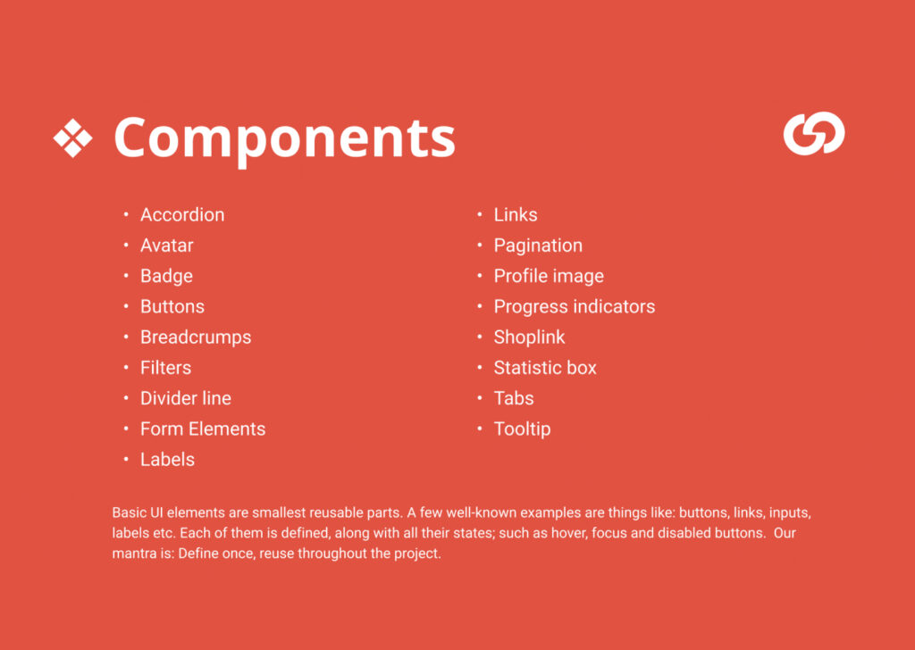
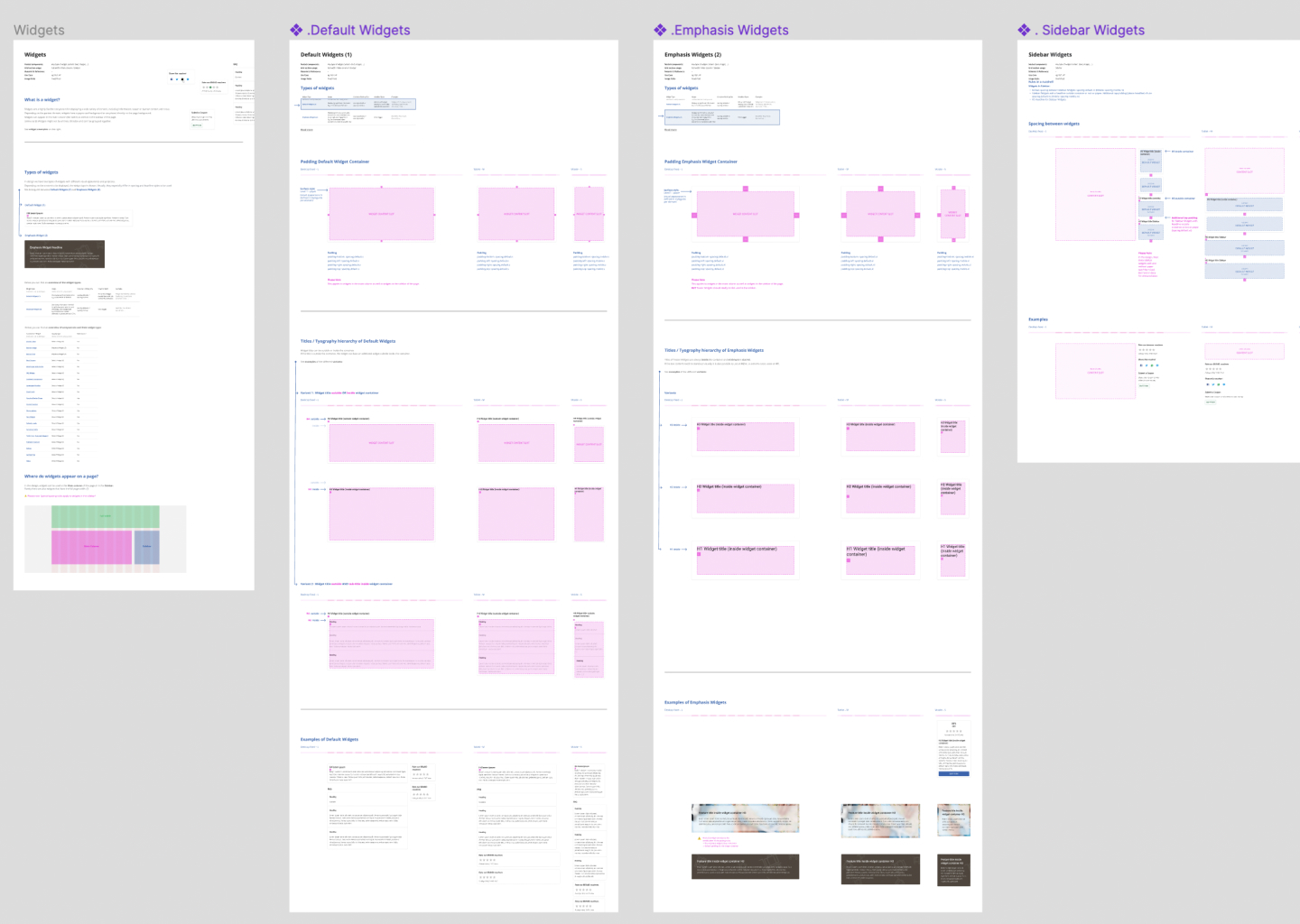
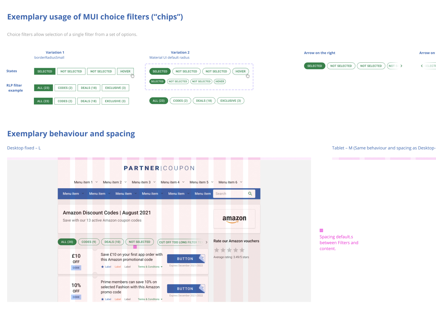
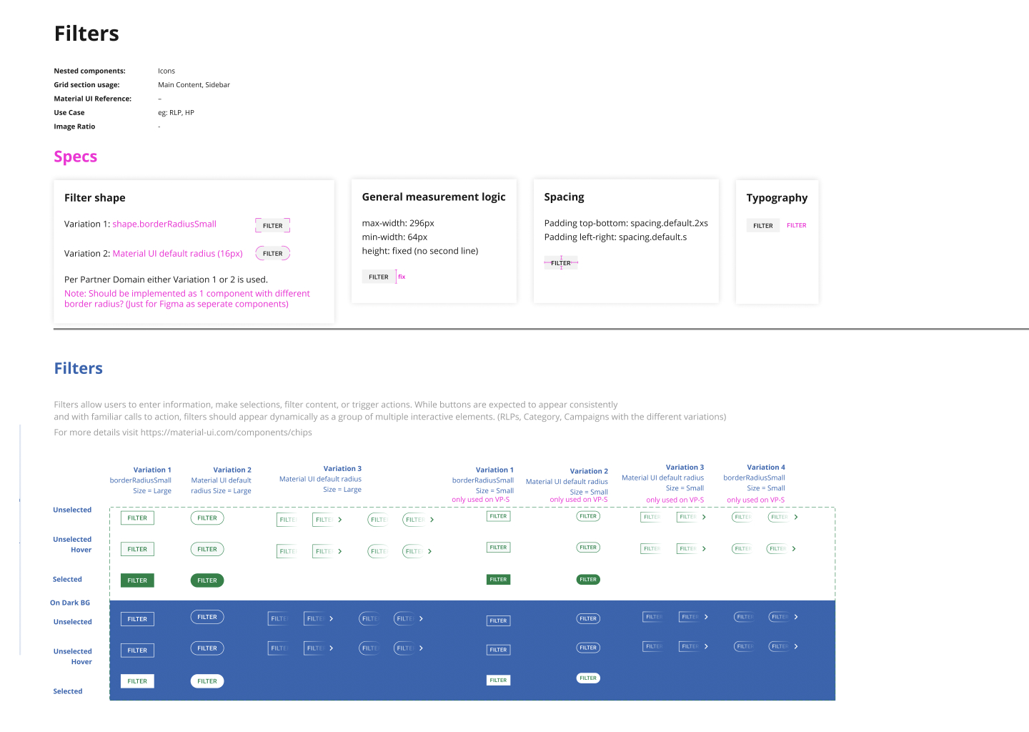
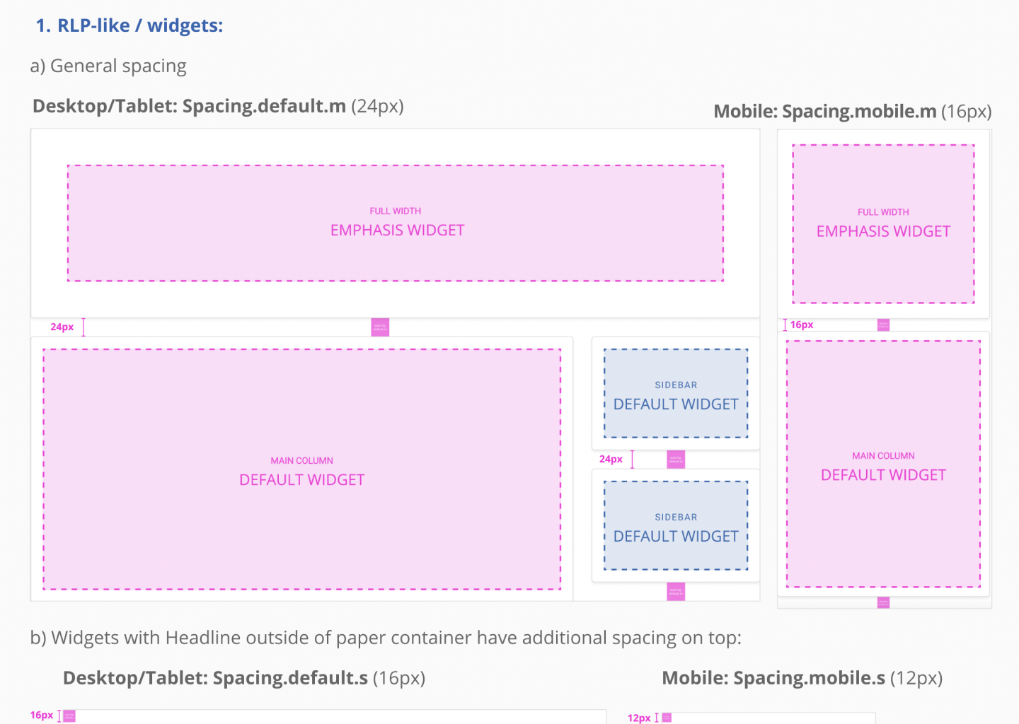
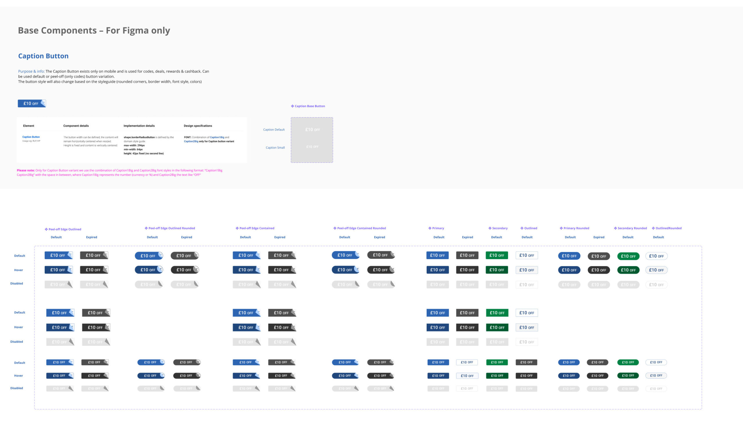
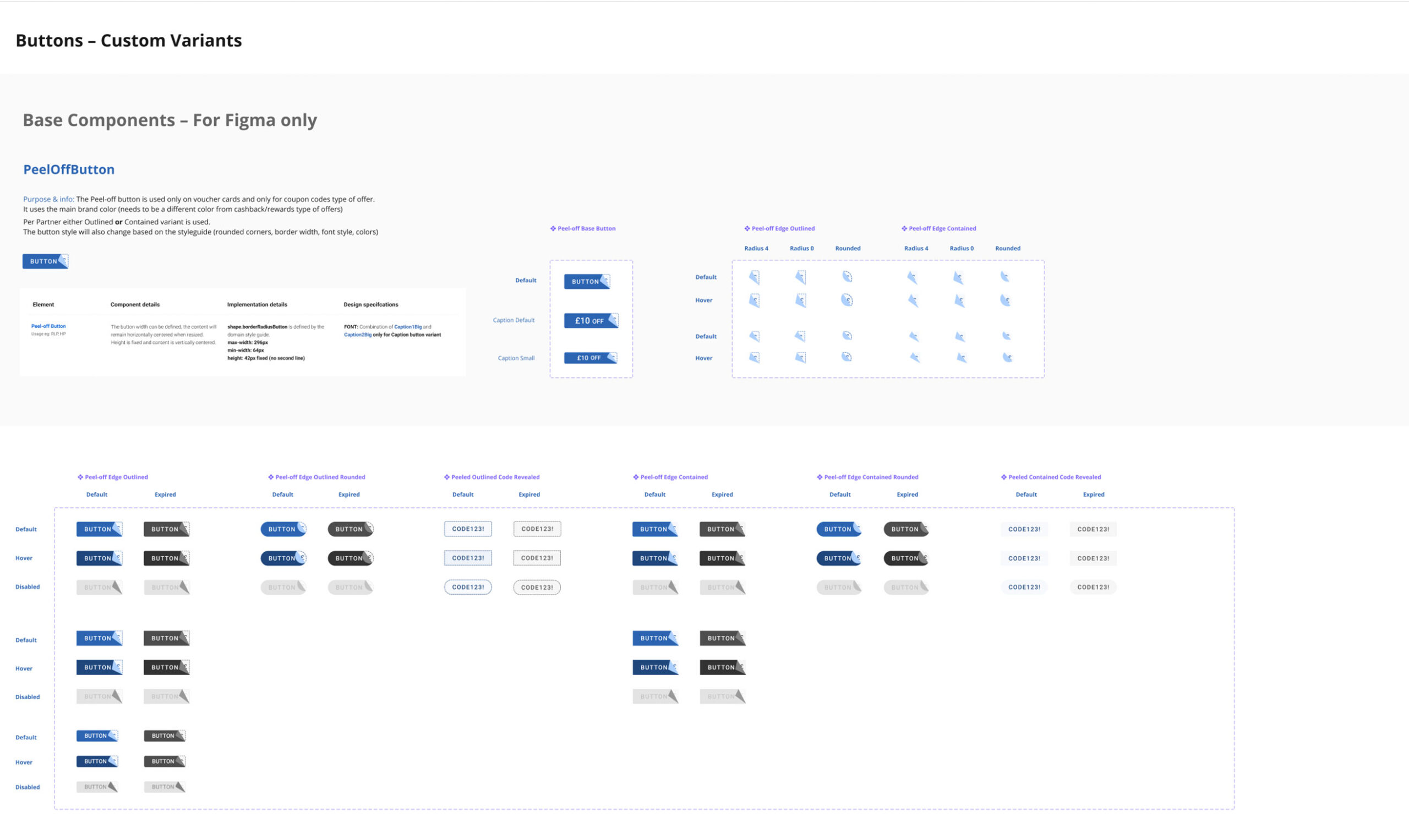
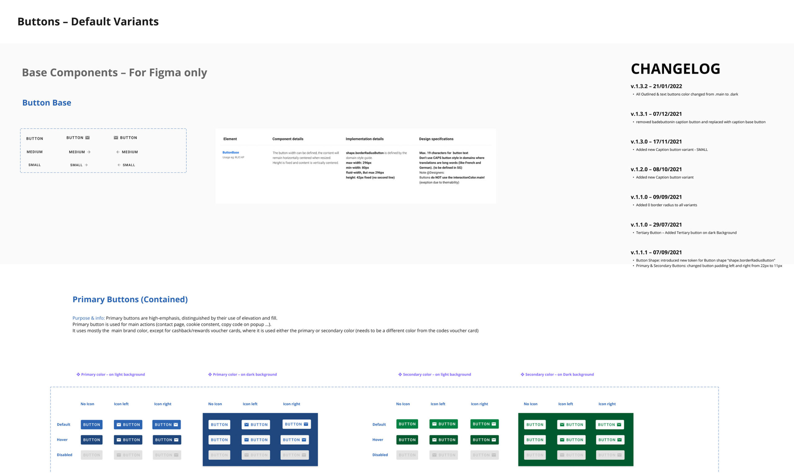
As the component library matured, I polished the visual design. The introduction of design tokens defined rules for typography, colours, and spacing, while a component library housed reusable UI elements.
Together, these tools created a foundation for consistency and scalability.
Testing & Validation
Refining through feedback.
I conducted remote usability tests with 15 participants. Watching them interact with the tool revealed insights I hadn’t anticipated for example, users wanted tooltips to explain metrics without leaving the page.
I made adjustments, adding contextual tooltips and improving responsiveness for mobile use. These refinements ensured the design catered to both desktop and tablet users.
Results & Impact
Measurable Outcomes.
When the dust settled, the results spoke for themselves:
- Setup times dropped by 50%, enabling faster launches.
- Visual consistency scores improved by 35%, strengthening brand trust.
- Task completion rates rose by 20%, improving usability.
For GSG, the system meant more than just operational efficiency it became a growth enabler. With faster onboarding, they could scale their partnerships seamlessly. Partners echoed this sentiment, with one remarking:
“Rebranding used to take days. Now, it’s done in hours.”
— Tessa
Reflection & Learnings
Insights and Lessons Learned.
What made this project special was its blend of flexibility and structure. By leveraging design tokens and reusable components, we didn’t just create a design system, we created a platform for growth.
Looking back, this project reinforced the power of scalable design. It showed me that true scalability isn’t just about efficiency; it’s about empowering users and businesses to grow without limits..
